
TAPiOCA Project
Overview
Context
Wizschool is an innovative edtech software company that educates coding to the early youth.
This summer, the company planned to develop the UX design for their newly launching app that applies their new programming language which would compete with Scratch and other text-coding programs.
My Role
UX Design/Interaction Design
1. Design the app’s overall flow and layout.
2. Create Interaction Design for the OOBC programming language.
Timeline
May 2020 - July 2020

Team
Chris Tae Seo Lee(Me) _ Product Designer
Jina _ Product Designer
Ben - Visual Designer
Het - Software Engineer


Solution
Introducing TAPiOCA App
We designed a mobile app that allows users (age 8-13) to simply tap the block-codes in and have freedom to build their own functional softwares. Furthermore, the app uses the company’s new programming language called OOBC.

⚠ ️Caution: for better understanding of the complex logic of coding, the designs presented below are just part of the solution.
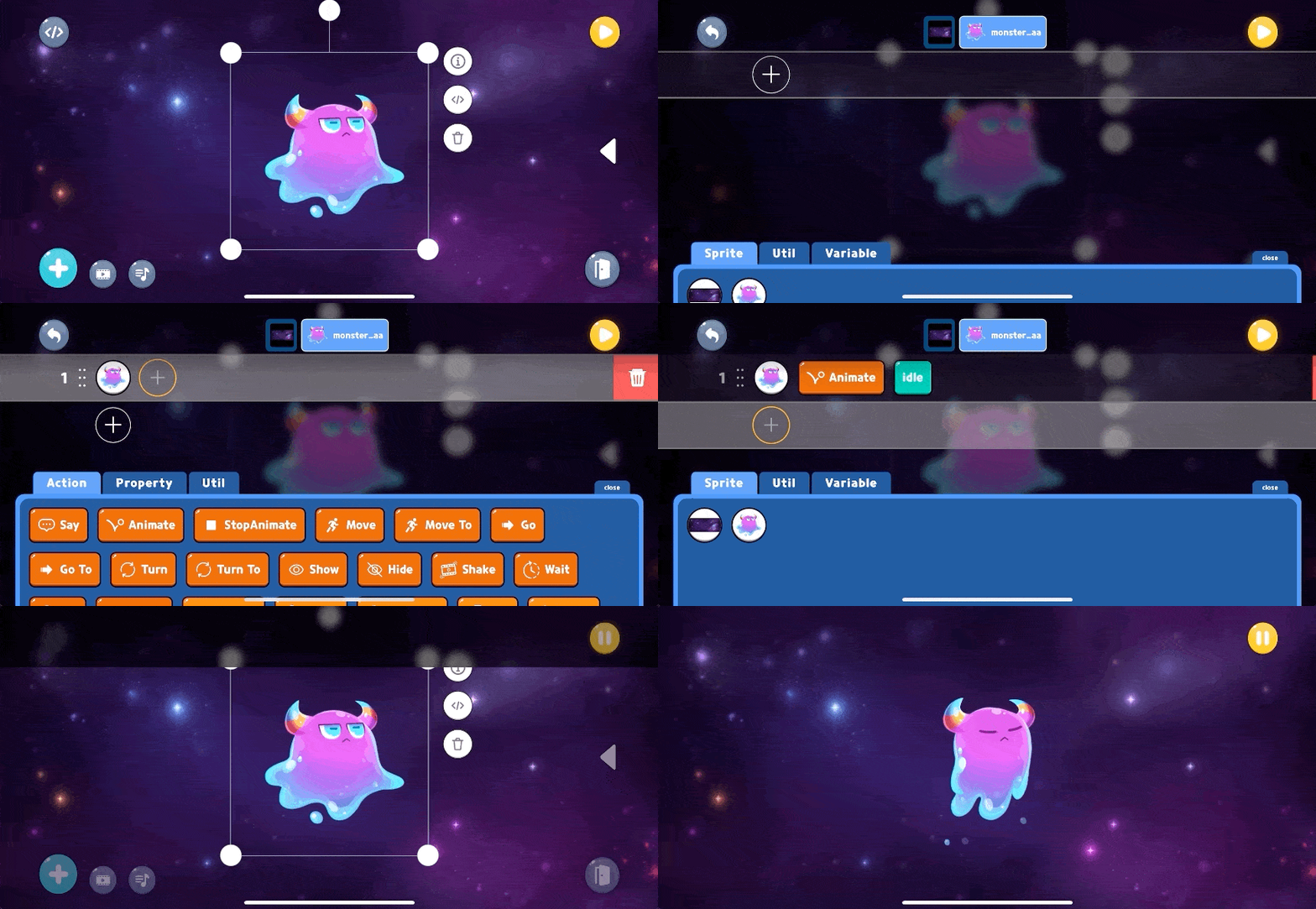
Tap Your Block-Codes In
You don’t need to drag or type in your codes to make softwares!
Coding had been a difficult language to understand and build for decades, so we made the experience easier for the children to understand the logic of coding and build the codes just by tapping on the phone screen.
Change/Delete Code Lines
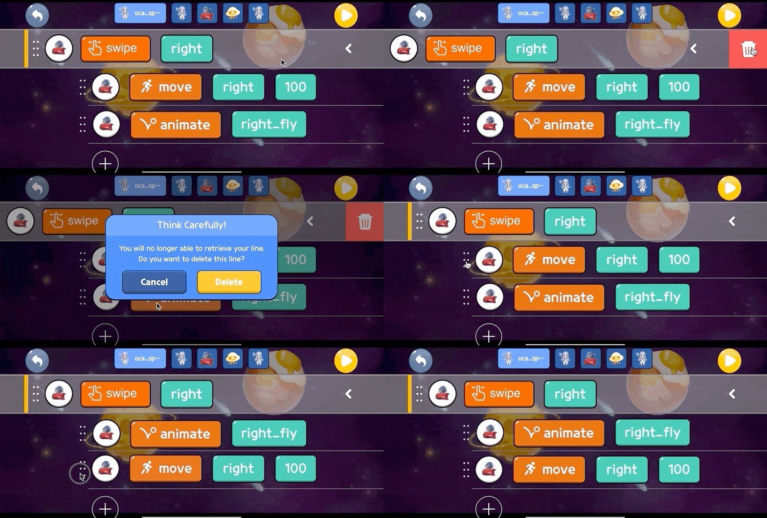
Drag the line to delete the line and drag the dot icon to change the order of your lines!
We make sure to warn you when you accidentally touch delete button that could diminsh your hard work.Also, changing the line can be easier than ever by simply dragging the dot icon on the each line.
Research
Understanding the Users
Parents are looking for easier and more entertaining programs to educate coding to their children
Due to the time constraint, I used Reddit to quickly understand the value the users want from the coding education. Assuming that the early youth (8-13) doesn’t really have a full control with the mobile phones, I wanted to also understand the parents’ perspectives on coding in education. What do they want from the coding education as the parents? What really worked with their own children when educating coding? As a millennial who never had a coding education back in youth, I was surprised that the parents now take computer science education very seriously and are looking for various ways to educate coding programs.

Market Research
How do other mobile and desktop apps educate coding?
While trying figure out how other apps educate our target audience, I found a pattern. The mobile products for code education were usually gamified with adventurous levels and limited UI elements to rather focus on the images and visuals. On the other hand, the desktop products varied, but they were mostly well-structured based on proximity of features.

Key Insight
🤔 Writing and Piling codes are too complex for our target users
The traditional text-coding and block-coding requires high level of comprehension level.
📝 Syntax of the codes plays essential part in coding
Many platforms focused on educating the importance of logical order of codes.
✨ Visuals and interactions bridge the early youth and coding
The early youth showed great performance in learning when educated with visuals.
📱 Due to overloading features, most coding platforms are not mobile-friendly
Not only has the coding experience been difficult but also the coding platforms themselves are difficult-to-use due to the overloading features on one screen.
Design Goals
3 main design goals were discussed to make sure our team was on the same page while developing the app. They were:

Success Metrics
Because this mobile app attempts to change the paradigm of coding, as a UX designer and Product Owner of the app, I had to set a few success metrics to make sure that users know how to interact with our interface, borrowing from heuristic evaluation.
🧠 Learnability
How easily can the product be learned by the users? Our product aims to change the paradigm of coding for the youth, so it must be innovative but also able to allow the users to learn how to interact with our interface.
📱 Memorability
After learning the experience, would the users be able to remember how to interact with the interface?
Coding Interaction
How can I incorporate the company’s new programming language into an interaction design to ease the coding experience for the early youth?
For the coding screen, I drew low-fidelity sketches and created quick prototypes to present to the teammates-including the CEO and CTO of the company-at the workshop, making sure that everyone is on the same page. The workshop was indeed intense because the coding screen was the most important element that would compete in the market.

Design Explorations
Fast Prototyping for the Team
This is the best part of the process. I explored various sketches and then created small prototypes to quickly communicate how the users can enter their codes. I was trying to stay away from the idea of “Writing the Codes” and “Stacking the Codes” as our target audience found them complex and difficult-to-learn. I made sure that the interactions were easy-to-use and mobile-friendly, so I’ve made these iteration prototypes on a mobile artboard using Figma.

🅰 Dragging and Dropping block-codes into sprites
Pros:
- game-like interface and interaction
- “equiping the code” metaphor seems more intuitive.
Cons:
- time-consuming (not learnable)
- difficult to learn the interaction at first
- pile of codes can become too complext after inserting only few codes

🅱 Expanding the available block-codes
Pros:
- intuitive and easy-to-understand (learnable)
- Expanding can show many possible block-codes the users can use
Cons:
- can be unorganized, making coding more complex on one screen
- technical constraints: difficult to display the maximum number of available block-codes
- mismatch with the mental model
Final Decision
Turning the everday interaction into an innovative interaction
At the workshop, I sketched an idea of “tapping the codes” metaphor from the keyboard interactions in our everday mobile phones, instead of “Writing the Codes” as mentioned in the key insights. To make sure the interaction is learnable and memorable, we’ve conducted a quick usability testing to the kids. The result was fantastic, the children not only enjoyed the interaction but also learned the logic fast.
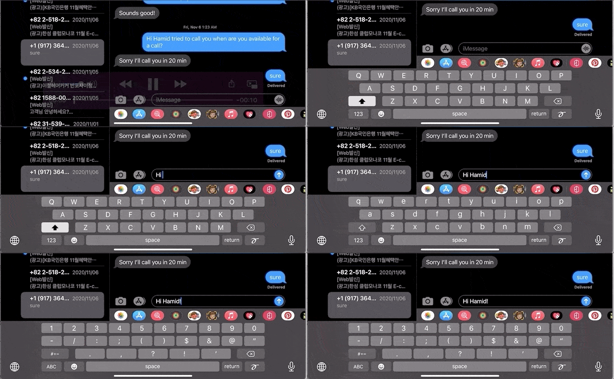
Keyboard Interaction from iOS


Final Interaction Design: Tapping the block-codes in

Tapboard Modals with different sets of block-codes
Prevention of Error Matters
Now, tapping the codes made it easier for the users to build codes and lines, what if they make mistakes due to its easiness?
From the moment we’ve decided the coding interaction, I partnered and closely communicated with one of our engineers, Het, to quickly catch the technical constraints and behaviors of the users as developers.
This helped me to solve the problem I’ve found-the order of code lines can determine the logic of action the user can perform. How can I make sure to warn the users about the consequences of action to the block-codes they’ve built without distracting them from tapping the codes in? Because the users must keep coding and too many warnings can distract them, I’ve made a clear line to prevent such distraction.

“Any action that could possibly destroy the user’s built codes must be warned”
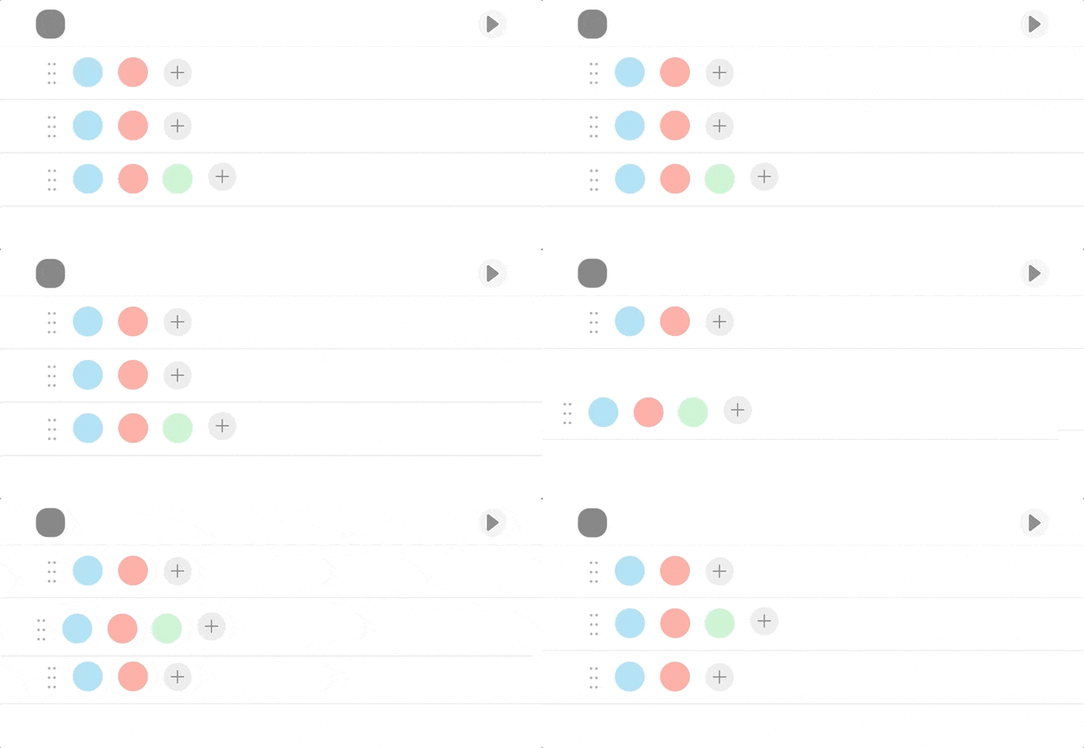
Changing the Line Order
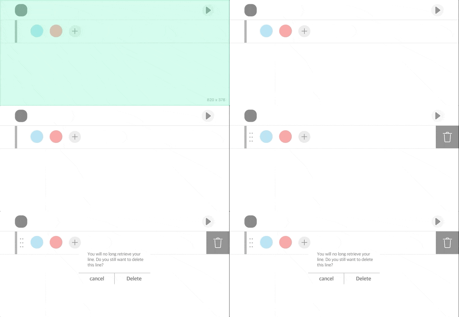
Changing the order of code lines do affect the logic of performance, but it doesn’t involve destroying the user’s codes, thus it doesn’t need any warning. The user can drag and drop the dot icon on the left to position the code lines wherever they want.
Deleting a Code Line
Deleting the individual codes and lines won’t be able to let the users to retrieve the codes they’ve built. The user can swipe the line and tap on the trash can icon to delete the line, but the warning pop-up appears to warn the users.
Impact
🤝 Product Sold to Investors
The objective of the development was to sell the product to the Chinese investors, and the company successfully sold the product to the investors and sponsors after presenting the beta version. The coding interaction became the selling point of the product. The product is now live!
💙 Positive feedbacks
from Users and Partners
During the usability testing with the education partners, the early youth was happy to interact with the product and the academy(partners) loved the new education method.


🌎 Currently being used to educate children in China and South Korea
TAPiOCA had been expanding rapidly across the nation and China to educate the computer programming to the children aged from 8 to 13.
Next Step
🌎 Expanding the Ecosystem
As the children learn the logic of coding with TAPiOCA, we must expect that they must move on to the next level of programming languages. Thus, we’ve discussed several ideas to implement in the future. For example, translating the codes that they made with TAPiOCA into regular programming languages such as Javascript. At last, they can further edit their software with more complex languages.


